
TBC Cards New Identity


About the project
What is TBC?
TBC is one of the largest and most forward-thinking banks in the Caucasus region. Known for its focus on innovation, digital transformation, and customer experience, TBC has become a key player in shaping the financial landscape of Georgia and beyond.
What We Created
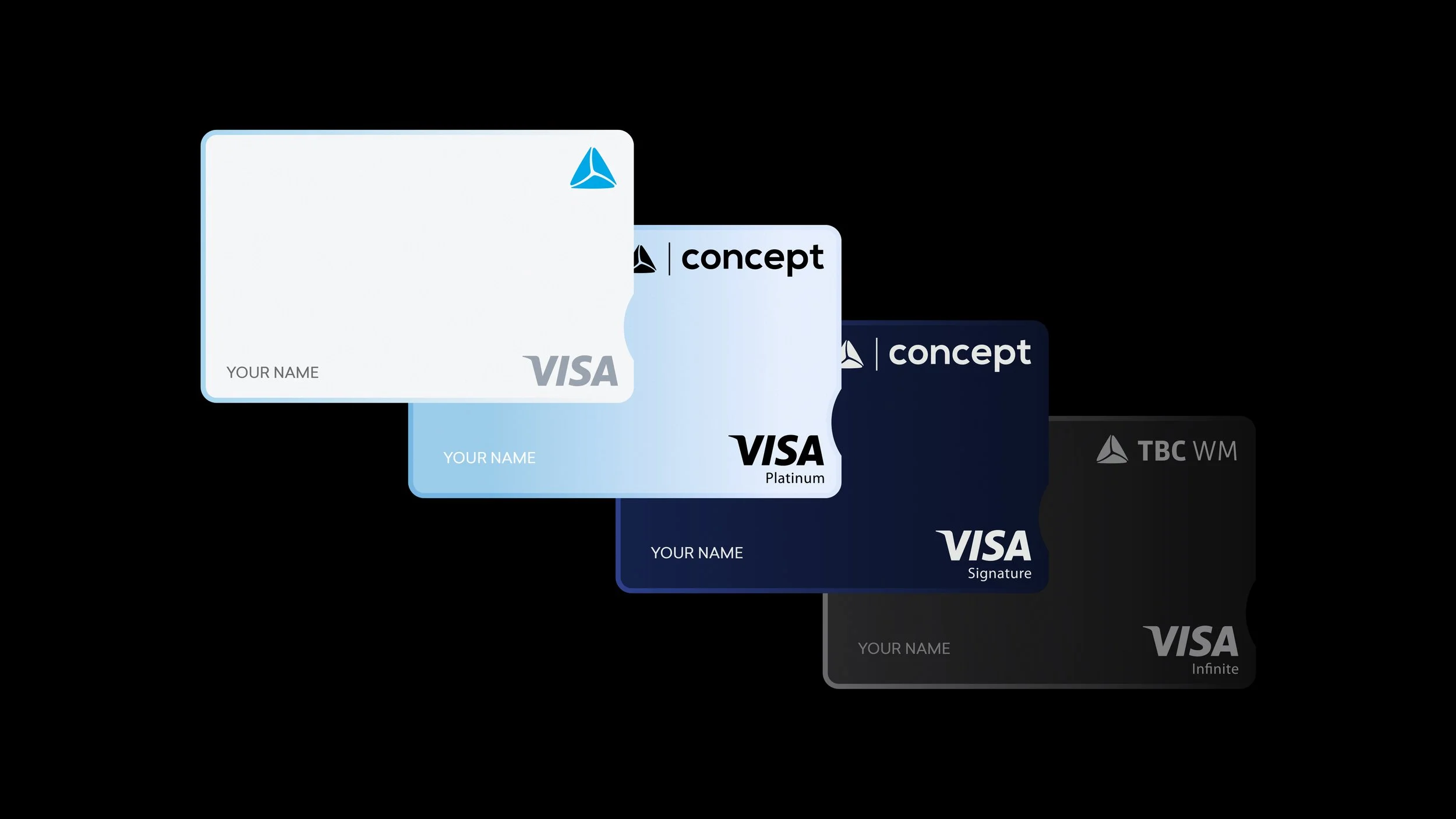
TBC approached us with a clear objective: to unify a fragmented and inconsistent card portfolio into a streamlined system. Over time, the bank had developed numerous card designs across different products and user groups. A visual ecosystem that had grown cluttered and confusing for customers.
Our task was to distill this complexity into four distinctive card styles, each tailored to a specific audience. The new designs needed to feel modern, premium, and unmistakably TBC.
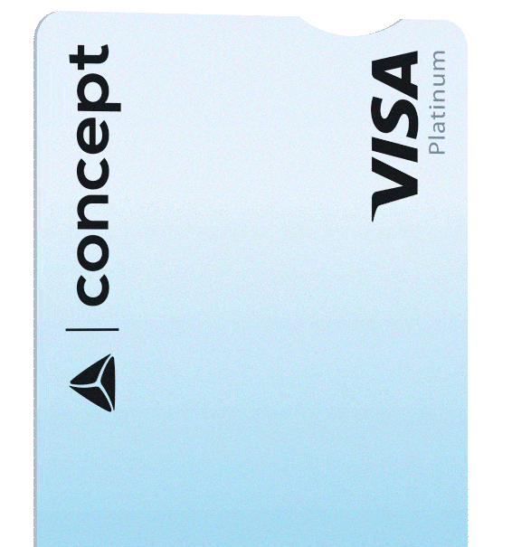
We began by establishing a professional design language that eliminated unnecessary visual noise, focusing instead on clarity and distinction. Central to the new identity is a signature design element: a rounded notch — the first of its kind in Georgia. More than a visual detail, it became a structural symbol of the brand’s bold and innovative spirit.
Color played a critical role in defining the new system. After multiple design explorations, we developed four refined colorways, each distinct in tone yet harmonized as a unified system. Paired with premium finishes and clean typography, the new identity exudes sleek sophistication, delivering a cohesive and elevated brand presence.
Collaboration
Design Institute